September 10, 2022
10 Laws of UX: The Psychology of User Interaction
UX Design Principles for Better User Experiences
The Laws of UX. These aren't legal mandates, but rather insights based on psychology and research that help designers create user-friendly interfaces.
This article aims to shed light on these fundamental principles, equipping you with knowledge to understand how UX design works and the thought process behind successful interfaces. By applying these principles, designers can craft interfaces that users find intuitive, efficient, and simply enjoyable to use.
Let's look at 21 UX laws—originally curated by product designer, Jon Yablonski, in his book and the resource Laws of UX. We’ll also look at examples so you can better understand how to put each law into practice.
1. Aesthetic-Usability Effect: The Power of Visual Appeal
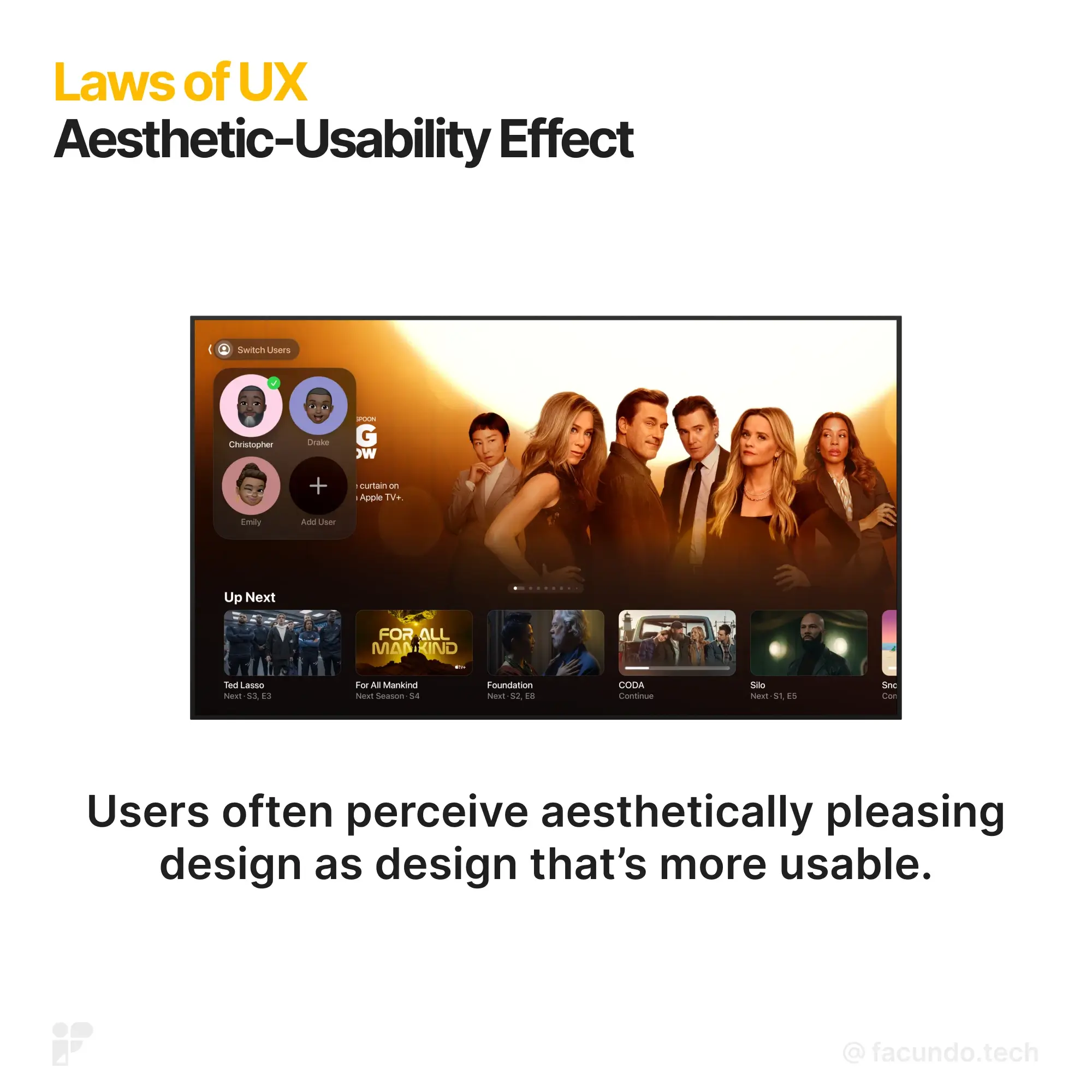
First impressions matter, especially in the digital world. When encountering a new site or app, users form instant judgments based on its visual appeal. This instinctive reaction has a surprising impact on their perception of how well it works – a phenomenon known as the Aesthetic-Usability Effect.
In simple terms, people tend to believe beautiful products are easier to use, even if functionality doesn't perfectly match appearance. This positive bias works in your favor:
- Attractive design creates a good first impression: Users feel more engaged and motivated to explore.
- Minor usability issues are forgiven: A visually pleasing interface can soften the blow of occasional hiccups.
- Testing can be blind to beauty's influence: Users become so captivated by aesthetics that underlying usability problems might go unnoticed.
While beautiful design is crucial, remember it's only one piece of the puzzle. Ensuring true usability comes down to intuitive information architecture, clear navigation, and seamless user flows.
The Origin: In 1995, researchers Masaaki Kurosu and Kaori Kashimura put it to the test. They asked hundreds of people to rate different ATM interfaces for both usability and visual appeal. Interestingly, the stronger correlation wasn't between aesthetics and actual ease of use, but between aesthetics and how perceived ease of use was. This confirmed that our brains are easily swayed by visual beauty, even in practical matters.
The Takeaway: Invest in making your product beautiful, but don't forget the foundation. Combine stunning visuals with intuitive interaction, clear functionality, and user-centered design to create a truly satisfying experience. Remember, beauty without brains might turn heads, but it won't keep users coming back for more.
2. Doherty Threshold: Speed Matters

Ever notice how a website that responds instantly feels more enjoyable to use? This isn't just a whim, it's a scientifically proven principle known as the Doherty Threshold. Essentially, when systems respond to user actions within 400 milliseconds, users stay engaged and productive. Here's what the research tells us:
- Quick feedback keeps users attentive: Delays beyond 400 ms can disrupt focus and engagement, making tasks feel sluggish and frustrating.
- Perceived performance is key: Even if a system technically operates fast, slow-looking animations or progress bars can create a feeling of waiting and decrease satisfaction.
- Visual cues can bridge the gap: Simple animations or progress indicators can keep users engaged during necessary processing times, making the wait feel shorter.
- Transparency builds trust: Progress bars, even if not perfectly accurate, offer a sense of control and understanding which can actually enhance user trust.
- Delayed gratification can add value: A slight, intentional delay in displaying results can create a sense of anticipation and make the outcome feel more valuable.
The Origin: The Doherty Threshold was established in 1982 by researchers who challenged the then-accepted standard of 2 seconds for computer response time. Their findings showed a dramatic improvement in user experience when response times dropped below 400 milliseconds, even describing such systems as "addicting" to use.
The Takeaway: In today's fast-paced world, speed is key. By prioritizing quick response times and clear visual feedback, you can keep users engaged, productive, and coming back for more. Remember, every millisecond counts when it comes to user experience!
3. Fitts’s Law: Adjusting sizes to success
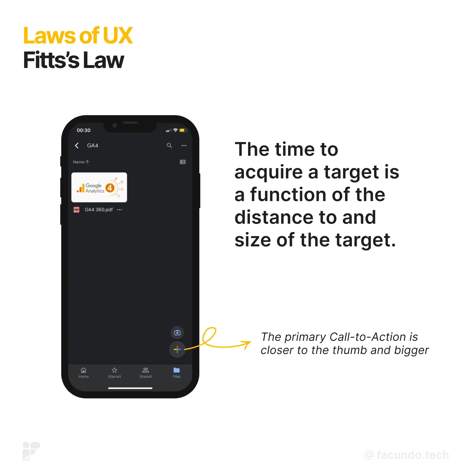
Ever struggled to tap a tiny button on your phone? Fitts' Law explains why. By applying Fitts' Law, you can design interfaces that feel intuitive and effortless. Users navigate faster, make fewer mistakes, and ultimately enjoy a smoother experience.
- Bigger targets are easier to hit: Larger buttons take less time and effort to tap, reducing frustration and errors.
- Space matters: Leave enough room between buttons to avoid accidental selection. No one enjoys hitting the wrong thing!
- Position wisely: Place important buttons within easy reach of the user's typical hand position. Don't make them stretch or fumble.
The Origin: Back in 1954, psychologist Paul Fitts delved into the workings of the human motor system. He discovered a simple yet powerful truth: how quickly we reach a target depends on both its distance and size. The further away a target is and the smaller it is, the longer it takes and the more likely we are to miss it. This concept of a speed-accuracy trade-off became the core of Fitts' Law.
The Takeaway: When designing touch interfaces, prioritize clear visual hierarchy, generous tap targets, and logical placement. By making it easy for users to reach their goals, you'll create a more efficient and satisfying experience.
4. Goal-Gradient Effect: The Power of Progress in User Motivations
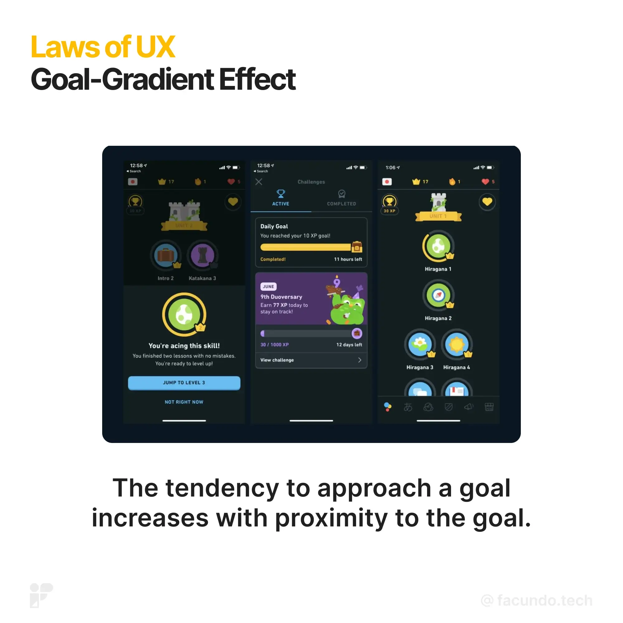
It simply means people tend to work harder and faster the closer they get to achieving their goals.
- Progress fuels motivation: By providing users with clear progress indicators, you can tap into their natural desire to finish what they started.
- Artificial progress can be a boost: Even showing artifitial progress can motivate users to continue, especially for complex tasks. Think of progress bars or loyalty programs.
- Clarity is key: Make progress indicators clear and easy to understand. Knowing exactly how far they've come and how much is left keeps users engaged.
The Origin: This phenomenon was first explored by psychologist Clark Hull in 1932. In a classic experiment, he observed rats running faster in a maze as they approached the food reward. While primarily studied in animals, the Goal-Gradient Effect impacts humans too, influencing our behavior in everything from completing tasks to participating in loyalty programs.
The Takeaway: Design interfaces and experiences that motivate users to keep going. Clear progress indicators, strategically placed rewards, and gamification strategies can help push users towards completing their goals, leading to a more satisfying and engaging experience.
5. Hick’s Law: Less is More
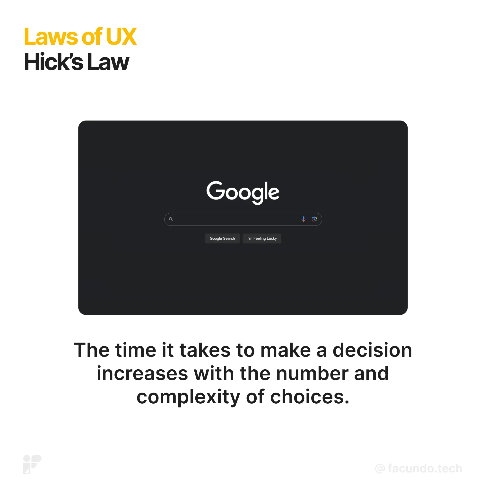
The more choices you offer, the longer it takes someone to make a decision.
- Less is fast: When quick decisions matter (think emergency buttons or checkout processes), presenting too many options can lead to delays and errors. Prioritize clarity and focus on essential choices.
- Break it down: Dividing complex tasks into smaller, easier-to-digest steps reduces mental strain and makes decision-making smoother. Think guided onboarding processes or step-by-step instructions.
- Highlight helpful hints: Offering curated options or clear recommendations can guide users towards the most relevant choices, especially for unfamiliar platforms or products.
- Ease them in: Introducing new users to complex interfaces gradually, through simplified onboarding experiences, eases them into the decision-making process without overwhelming them.
The Origin: In 1952, psychologists William Edmund Hick and Ray Hyman identified this core principle - the more choices, the longer the decision time. Their principle, now known as Hick's Law, has had a profound impact on how we design interfaces, ensuring they guide users smoothly towards their goals without drowning them in options.
The Takeaway: Hick's Law empowers you to design interfaces that guide users towards confident choices. By streamlining menus, simplifying tasks, and providing helpful recommendations, you can create a smooth and enjoyable experience for everyone. While simplifying choices is key, avoid going too far. Users value control and variety. Aim for a golden balance between offering enough options and keeping things clear and focused.
Hick's Law isn't limited to just the number of options. Factors like the complexity of information, the clarity of labels, and even the layout of elements can all influence decision-making speed. By keeping these factors in mind, you can design interfaces that not only minimize choice overload but also maximize user understanding and engagement.
6. Jakob’s Law: Leveraging Existing Mental Models
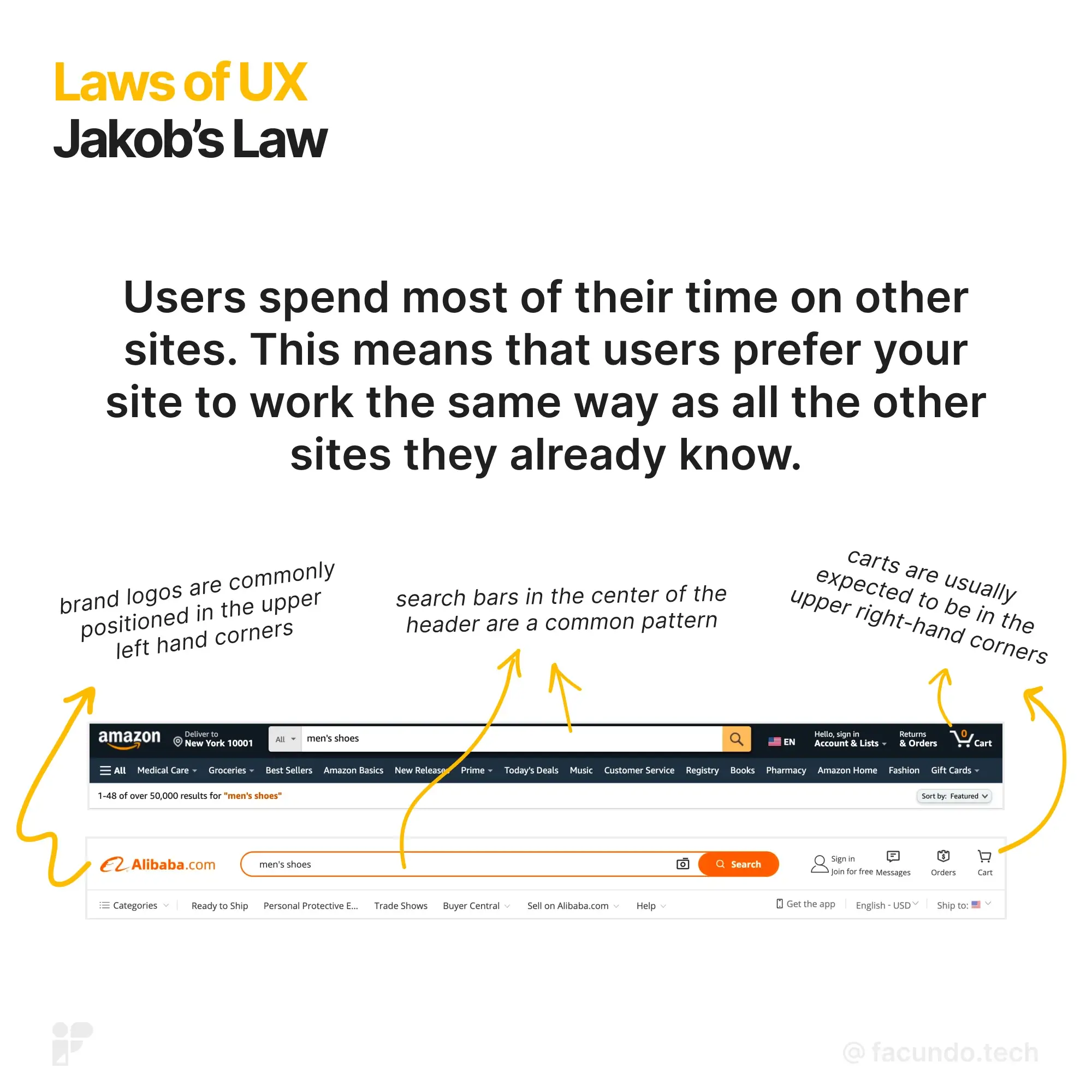
Users spend most of their time on other sites. This means that users prefer your site to work the same way as all the other sites they already know.
- User Expectations Travel: Users will expect your site to behave similarly to other familiar products they've used. If it looks like something they already know, they anticipate it to work that way.
- Tap into Mental Models: Building on existing mental models helps in crafting top-notch user experiences. This way, users can concentrate on their tasks without having to learn new ways of doing things.
- Smooth Transitions: When you make updates, allow users to stick with a version they're comfortable with for a limited time. This minimizes any confusion or frustration during the transition.
The Origin: Jakob's Law, named after Jakob Nielsen, a User Advocate and co-founder of Nielsen Norman Group, stems from the idea that users lean towards what they already understand. Dr. Nielsen, a pivotal figure in usability engineering, initiated the 'discount usability engineering' movement and introduced methods like heuristic evaluation for swift and economical UI enhancements.
The Takeaway: By acknowledging Jakob's Law, you recognize the power of familiarity in user experiences. Users prefer what they already know, so align your site with their expectations. Leverage existing mental models to streamline interactions. When making updates, provide a transition period, allowing users to stick to what's familiar, minimizing confusion. This user-centric approach ensures a smoother and more comfortable journey on your platform.
7. Law of Common Region: Creating Visual Order
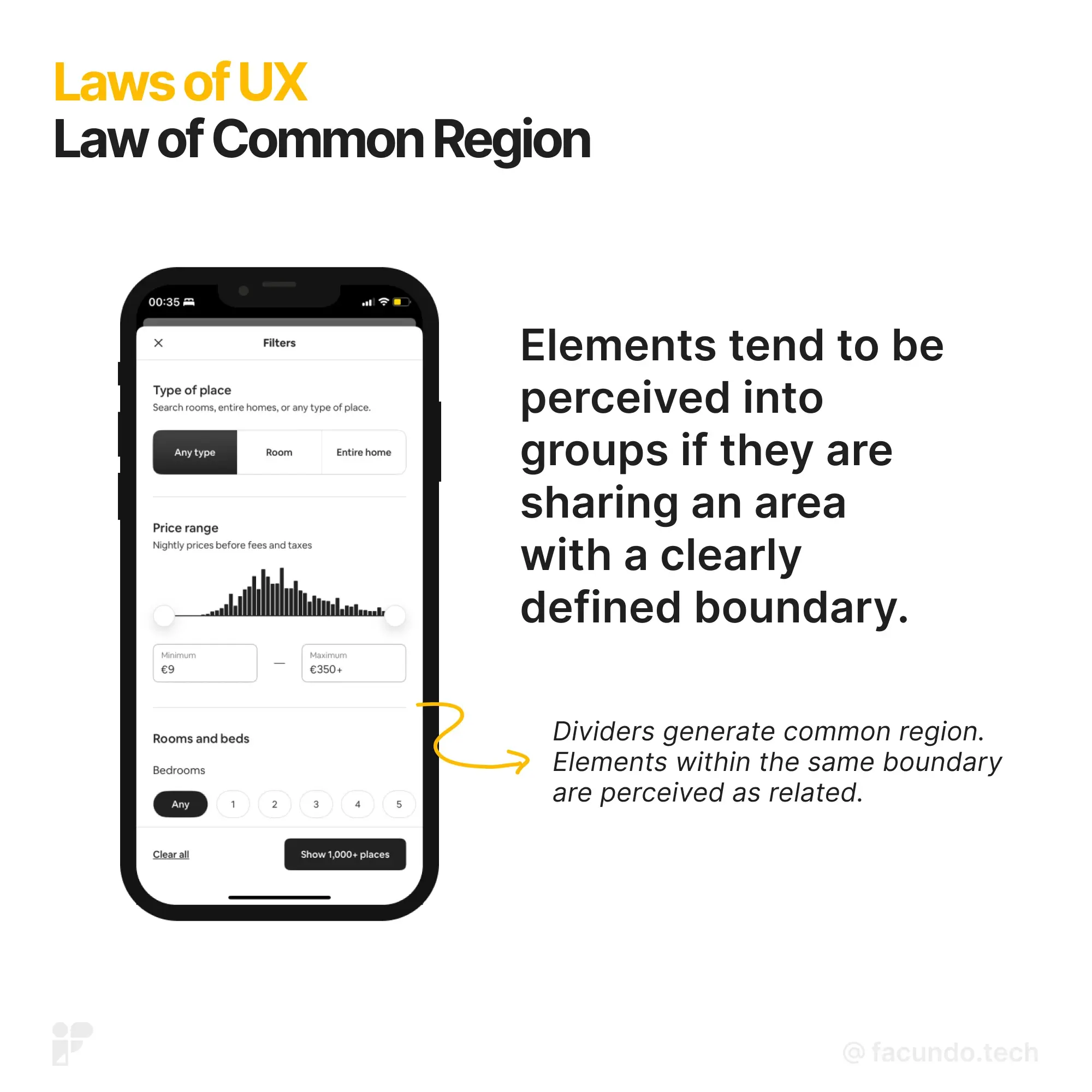
Elements tend to be perceived into groups if they are sharing an area with a clearly defined boundary.
- Structured Understanding: Common region brings clarity, helping you swiftly grasp how elements and sections relate. It acts as a visual organizer.
- Simple Implementation: Make things clear by adding a border around an element or a group. It's a straightforward method to establish common regions.
- Background Definition: You can also define a background behind an element or a set of elements to create a common region. It’s about creating visual separation.
The Origin: The principles of grouping, also known as Gestalt laws, originated in psychology. Gestalt psychologists, who were into explaining how humans naturally perceive organized patterns, introduced these principles. It boils down to Prägnanz – the idea that the mind is wired to see patterns in stimuli based on certain rules. The principles, categorized into Proximity, Similarity, Continuity, Closure, and Connectedness, form the foundation of the Law of Common Region in UX design.
The Takeaway: Understanding the Law of Common Region brings clarity to your design strategy. Visual teamwork is achieved through proximity, as elements within the same region are perceived as connected. Implementing clear boundaries or backgrounds establishes common regions, aiding users in organizing information effortlessly. Keep it straightforward, use borders wisely, and create visual separations to guide users seamlessly through your interface.
8. Law of Proximity: Streamlining Visual Connections
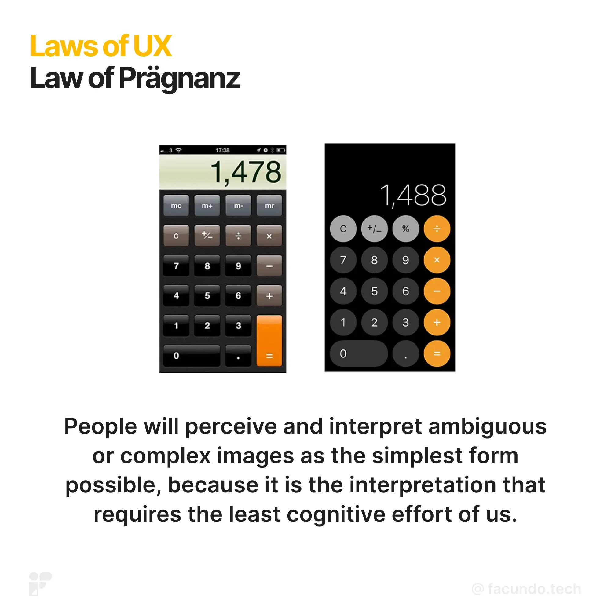
Objects that are near, or proximate to each other, tend to be grouped together.
- Establishing Relationships: Proximity creates a connection between nearby objects. It's like visual teamwork.
- Functional Perception: Elements near each other are thought to have similar functions or traits. It’s a natural way the mind organizes information.
- Swift Understanding: Proximity helps you grasp and organize information quickly and efficiently. It's about making things visually straightforward.
The Origin: The principles of grouping, also known as Gestalt laws, were introduced in psychology to explain how humans naturally see organized patterns. Gestalt psychologists, calling it Prägnanz, argued that our minds are wired to perceive patterns in stimuli following certain rules. These principles, including Proximity, Similarity, Continuity, Closure, and Connectedness, lay the foundation for the Law of Proximity in UX design.
The Takeaway: Embracing the Law of Proximity enhances user experience by simplifying visual connections. Prioritize larger, well-spaced buttons for easy interaction. Intuitively position important elements, keeping them within reach. This approach streamlines navigation, reduces errors, and ensures a more efficient user journey. By applying Fitts' Law, you contribute to an interface that feels natural and effortlessly responsive.
9. Law of Prägnanz: Guiding Through Simplicity
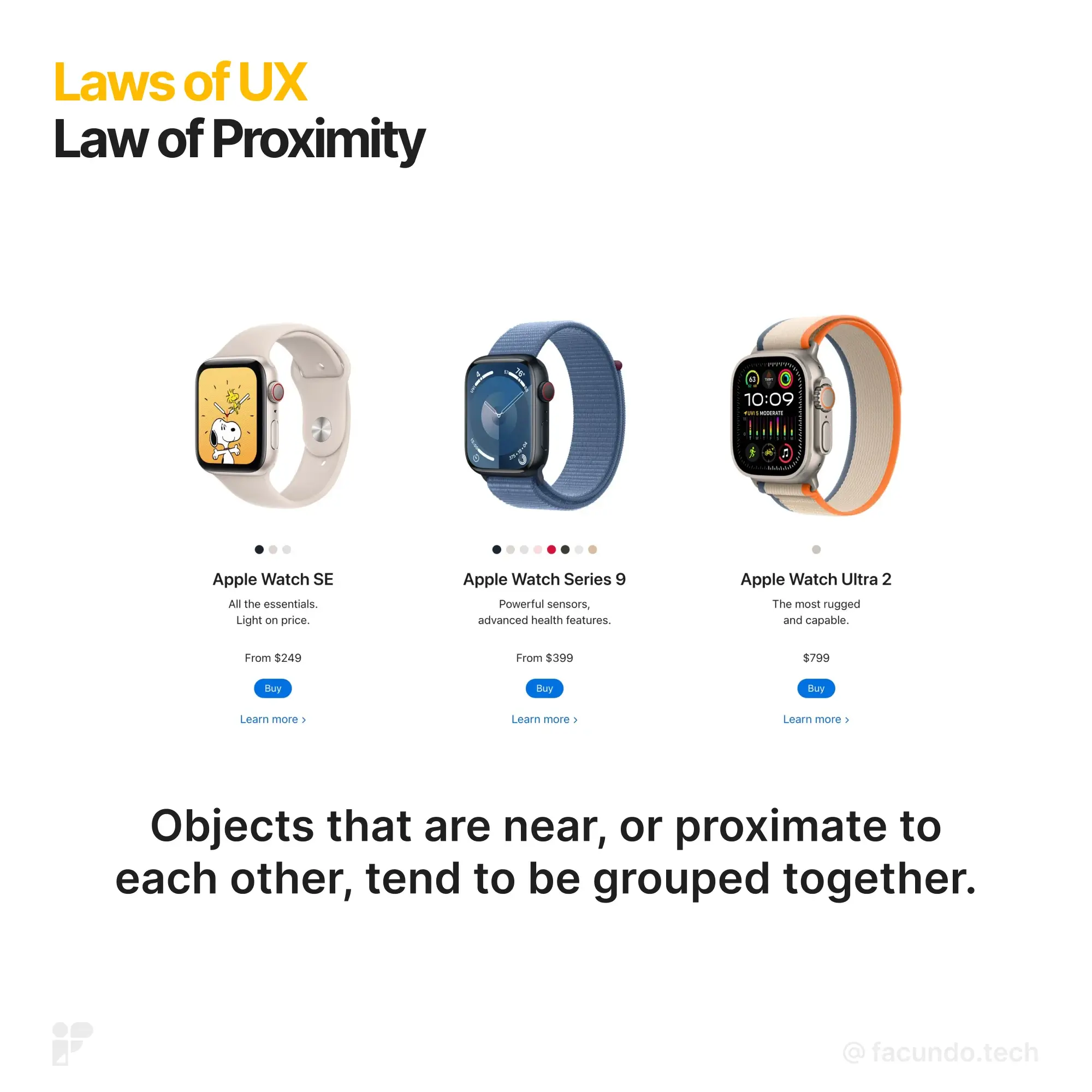
People will perceive and interpret ambiguous or complex images as the simplest form possible, because it is the interpretation that requires the least cognitive effort of us.
- Preventing Overwhelm: Your eyes like simplicity in complex shapes. It's a natural defense against getting swamped with too much information.
- Research-Backed: Studies show you process and remember straightforward shapes better than complicated ones. Your brain prefers the easy route.
- Simplification Process: When faced with complex shapes, your eyes simplify them into one unified form. It's how your brain streamlines information.
The Origin: Back in 1910, psychologist Max Wertheimer had an epiphany watching lights at a railroad crossing. It was like the flashing lights on a movie theater marquee. Even though it seemed like one light moving, it was just bulbs turning on and off. This insight birthed principles about how we visually see things. These principles, including the Law of Prägnanz, guide graphic design and how we create visual experiences.
The Takeaway: Incorporating the Law of Prägnanz is about harnessing the power of simplicity. Prioritize clear visual communication to prevent overwhelm. Research-backed evidence emphasizes the brain's preference for straightforward shapes, aiding in better information retention. Ensure your design facilitates a simplified interpretation, guiding users through a seamless and easily comprehensible experience.
10. Law of Similarity Enhancing Visual Bonds for User Understanding
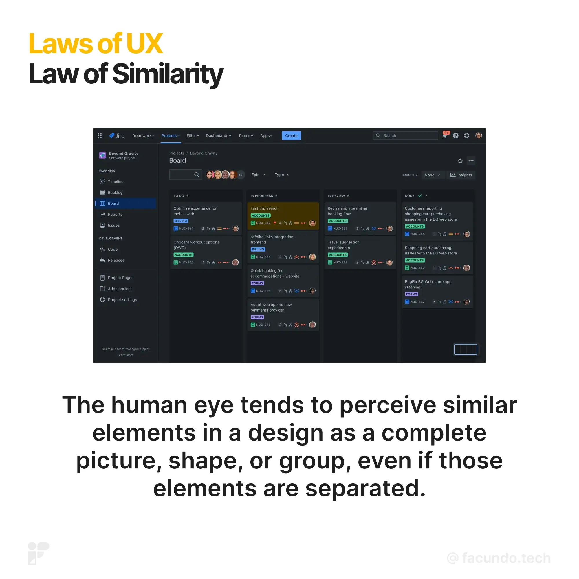
The human eye tends to perceive similar elements in a design as a complete picture, shape, or group, even if those elements are separated.
- Visual Bonds: If elements look alike, your brain sees them as connected. It's a quick way your mind makes sense of things.
- Signals of Unity: Color, shape, size, orientation, or movement shout, "We belong together!" Use these signals to show common meaning or function.
- Differentiate Navigation: Make sure links and navigation stand out from regular text. Clear visual distinctions help users smoothly navigate.
The Origin: The principles of grouping, or Gestalt laws, come from psychology. Gestalt psychologists, like the Law of Prägnanz we talked about earlier, noticed how humans naturally organize patterns. Similarity is one of these principles, alongside Proximity, Continuity, Closure, and Connectedness. They are the brain's rules for making sense of what we see.
The Takeaway: Understanding the Law of Similarity enables you to guide users effectively. Visual bonds formed through similarity provide quick comprehension. Leverage color, shape, size, orientation, or movement to signify connections. Maintain clear navigation by differentiating links from regular text. By incorporating these principles, you craft interfaces that align with the natural patterns of human perception, ensuring a user-friendly and cohesive visual experience.